It’s easy to say “That is a really nice/great/beautiful/bad/awful photograph”, but it’s even better to get a real critique of it where the person can explain what it is about the photograph that makes them like/dislike it. Here are some thoughts on how to discuss and evaluate photographs.
FROM NEGATIVE TO POSITIVE
Critiquing should never be negative in my view…it’s not about saying this is terrible, this is wrong, pointing out all the mistakes…it should be about how an image could be improved…it should be a learning experience. The person being critiqued should be able to take what they are given and apply it the next time they are taking photographs.
Most people I find get turned off or are reluctant to ask for a critique for fear of the negativity associated with it. But if it can be framed in a positive way, it becomes about improvement.
When asked for a critique, I always start with a positive… “I like how you (did this)…” “This was a great moment you captured…” “I love the line and how it draws the eye to the subject” , followed with how the image could have been improved. “But…. I find there is too much background and it distracts…” “but the light is a bit harsh, it would have been better under a softer light like overcast, or if you used a reflector.” “but the wide angle distorts the subject a bit too much.”
Start from something positive, move to how it could be improved, that is much more constructive in my opinion.
TIPS FOR BETTER CRITIQUING
Again, we want to give something more than a simple I like/dislike this photo…and it’s not difficult to do.
The first question you need to ask is what type of photograph is it? Photography has such a wide range of “genres”, from abstract to news to landscape to portrait to snapshots to scientific. Which genre does the image you are looking at fall into? The type of photographs may have different criteria which you will judge the photo on.
What is the photo about? What story is the photograph telling? The whole goal of photojournalism is to tell stories by using photographs. Many times there is a caption below the image in newspapers and magazines that tells the story or provides extra information, but you should be able to look at the photograph and know what genre it fits in.
How does the image make you feel? Does it trigger an emotional or physical response when you look at it?
Is there more than meets the eye? Is there a hidden message in the image? What message are you perceiving from the photograph?
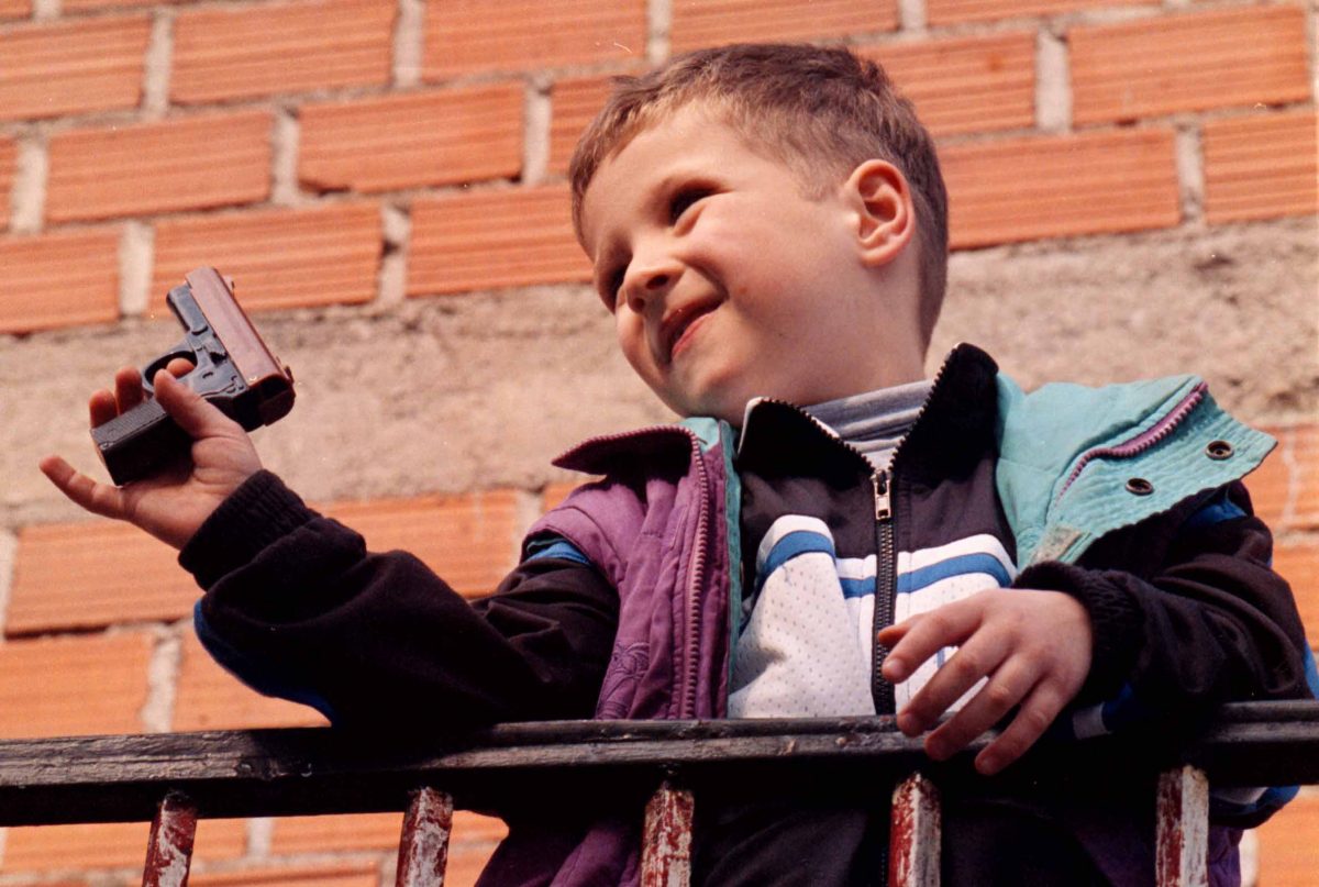
When I did an exhibition of my photographs taken while covering peackeepers in war-torn Bosnia, the photograph above got the most comments. What does the photograph say to you?
The photograph itself is a perfect illustration to the story we were doing. Just before this boy came out, we where speaking to his grandfather about the fact that because they grew up during a war, all the children in Bosnia play with guns…and just like that, his grandson comes out on an above balcony playing with his toy gun.
Many comments spoke about the gun…how real it looked…one person mentioned that after viewing the photograph they felt ashamed to have bought their children toy guns…that it was a sad commentary on society.
COMPOSITION ELEMENTS
What stands out in the image and draws your eye in?
How is the photograph framed? How does the framing affect the photograph? Could it have been framed differently to make a stronger image?
How does the way the image is cropped affect it? Could it be made into a stronger image if it were cropped differently?
What composition elements are present in the photograph?
What is the emphasis of the photograph?
What distracts you?
How does your eye move around or through the photograph?
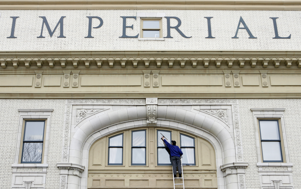
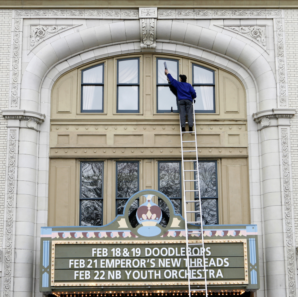
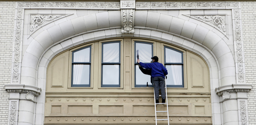
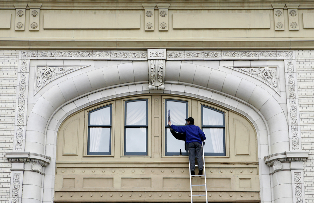
The photos below are various composition possibilities of a scene. Which one(s) do you find the most appealing? Why?
The first one, buy including the large letters, I find makes the window washer smaller and the building more imposing.
Going vertical allows to show the marquee….although it may be a distraction…
Zooming in close focuses on the architecture lines and patterns…nice and tight.
Pulling farther back a bit brought in the beige feature above….but is it needed, or a distraction?
TECHNICAL ELEMENTS
LENS
What lens was used? How did it affect the look of the image?
SHUTTER SPEED:
What shutter speed was used? Was it critical to how the image turned out?
APERTURE/DEPTH OF FIELD:
What is sharp in the image? Is everything in focus, or just a particular subject? How was the depth of field used to affect the photograph?
FILM/ISO:
What type of film was used, color or black and white? What effect does that have on the image?
What film speed or ISO was used? If the image is grainy, does it add to the effect?
LIGHT
What type of light is the photograph taken under? What direction is the light coming from?
How does the light affect the photograph?
What time of day was the picture taken?
How does the color of the light affect the photograph?
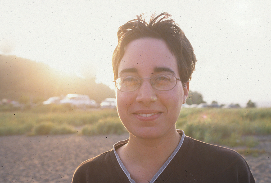
This photograph has lots of critique potential for all the apsects I’ve mentioned. Having my wife backlit against the sun creates flaring, which is distracting. To correct the exposure, I metered from her face…which then made the background go extremely bright and washed out, also distracting. The photograph was shot with a wider angle lens, creating unflattering distortion in her face. She is placed in the middle of the frame, when putting her on the thirds would have worked better.
Instead, having her face the sun results in a nice warm light on her, which matches the light on the background. A normal lens (50mm) takes away the distortion. Putting her on the thirds breaks the space up better and makes it more pleasing to my eye. The only issue would be the light reflecting of her glasses, which I could have easily fixed by having her tilt the arms of her glasses forward.
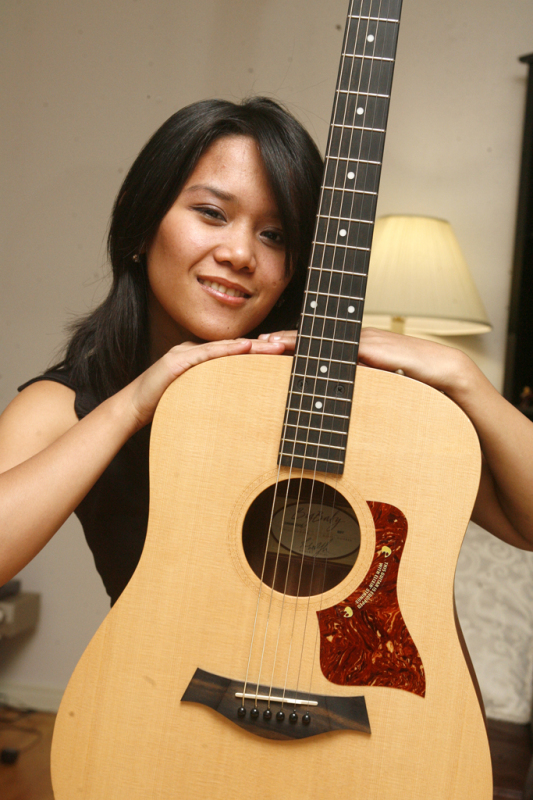
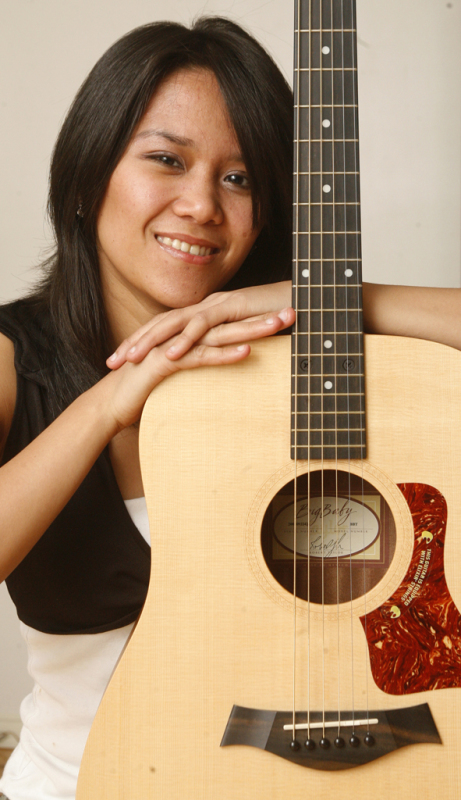
The photo on the left is a nice portrait of this musician…but some distractions for sure. I like the tilt, the expression is good, the pose works…but there is the bright ugly lamp in the background. That was a simple fix..just put the lamp on the floor or change the angle so the girl blocks it. And there is the black mirror or bookcase on the right too. To the right is a tighter crop…no lamp or other distractions, but I didn’t really like the pose as much.
These are some simple questions you can ask yourself when looking at photographs that will allow you to evaluate and discuss the photograph beyond a simple statement of like/dislike. The photographer will appreciate it!
Noel
PS-
To the person who’s work is being critiqued…so you’ve put your image out there, and maybe have gotten some not so great feedback…
Ask yourself this: At the end of the day, who are you taking the photograph for?
YOURSELF.
So even if no one on the planet likes your photo, does it really matter?
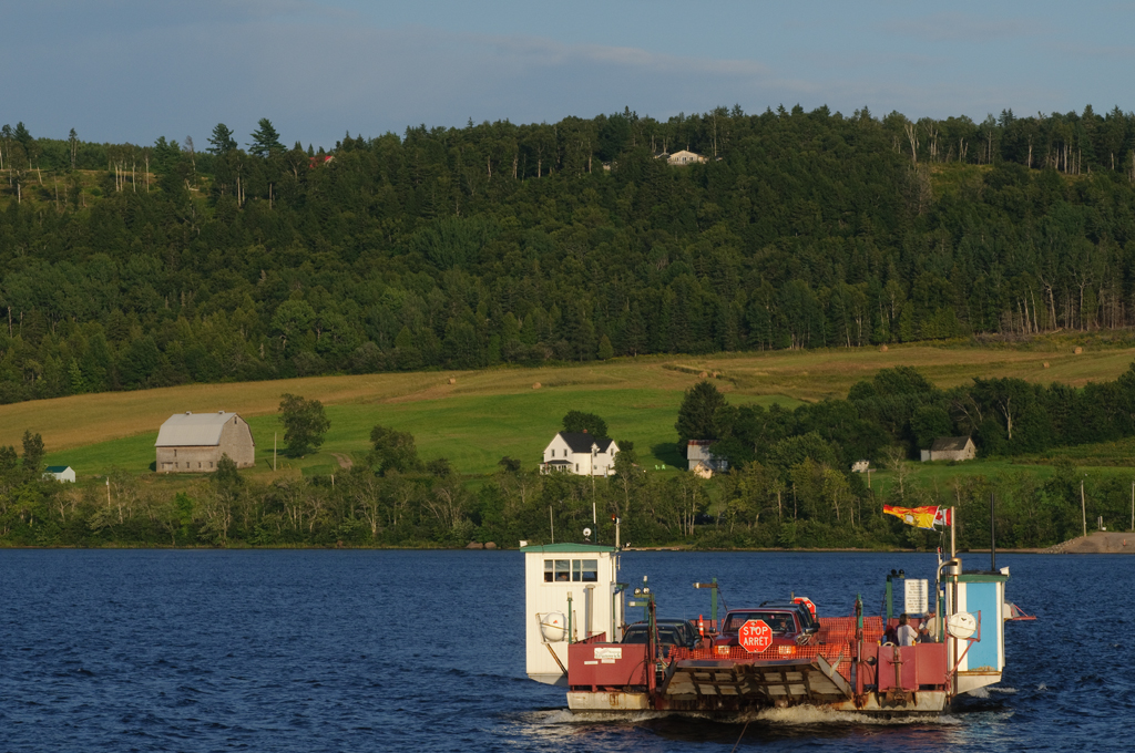
You have to realize that this critique is the opinion of that person, how they would have approached the shot. It doesn’t make them right. My students have started calling me “the skycropper” because I will recommend that empty overcast or over exposed skies should be cropped out because they are distracting…but that’s just how I would do it.
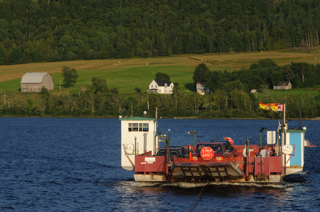
To me, this sky isnt nice and blue, so it takes away from the ferry…and the line of treetops draws the eye away…then you have that field in the top right, the house at the top…all distractions.
This is the crop I would suggest:
The SKYCROPPER strikes again!
Happy Shooting!
Noel Chenier
———-
Photographer and teacher
Connect with Noel on INSTAGRAM or TWITTER or via EMAIL
Photography Assignment Generator Apps now available on the app store!
Noel’s Portfolio
Work Done by My Students!
(607)


Thanks Noel for all your tips i love to learn and want to soak up as musch as i can amd learning from someone as talented as yourself will help me become a better photographer.<br />Sincerley,<br />Dan